Redesigning the online experience of a South African favourite
The client
Woolworths is a premium retailer that is known for selling quality produce, clothing, home and beauty items to consumers within South Africa.
The problem
The problem at Woolworths Online stemmed from the diverse shopping needs of users across different categories—such as Food, Fashion, Beauty, and Home. Each department with unique browsing and purchasing behaviors. This created challenges in designing a cohesive experience that could cater to these varying needs while ensuring a seamless journey across different product categories. The goal was to enhance the user experience from the Product Listing Page to the Product Description Page, while also creating a modern and clean UI that aligned with the Woolworths brand and made it easy for users to navigate through the site regardless of their shopping focus.
The process
I conducted research to understand current usability problems the current website faced and to define local and international benchmarks for ecommerce sites. We were able to use the research to define UX and UI improvements for the PLP (Product Listing Pages) and PDP (Product Description Pages) for the various departments (Food, Fashion, Beauty and Home), as well as design a new UI to elevate the brand.
The impact
Enhanced user experience: improved the user journey across different product categories (Food, Fashion, Beauty, and Home) by addressing unique browsing and purchasing behaviors.
Optimized Product Pages: streamlined the Product Listing Pages (PLP) and Product Description Pages (PDP) to ensure a smoother, more intuitive browsing and shopping experience.
Modernized UI: delivered a fresh, modern, and clean user interface that aligned with Woolworths’ brand, enhancing the overall aesthetic and usability of the site.
Improved navigation: simplified site navigation, making it easier for users to move between different departments and find products based on their specific shopping needs.
Data-driven design decisions: utilized research findings and benchmarking against local and international ecommerce sites to guide design decisions and ensure the site met user expectations and industry standards.
Stronger brand presence: elevated the Woolworths brand online through a refined design that reflects its modern identity while improving overall user satisfaction.
Increased conversion potential: by improving the usability of key pages and the site’s design, the enhancements contributed to a higher likelihood of users completing purchases.

Understanding the local and global landscape
I conducted research on local and international competitors in the Food, Fashion, Beauty, and Home departments to develop benchmarks. To further define improvement opportunities and enhance the overall customer experience for the PLP and PDP pages, I completed a feature audit along with an UX audit.
Based on our research, we identified key areas for improvement for the PLP Cards, Filtering, Grids, and PDP pages, and presented our findings in a presentation to key stakeholders for each department.
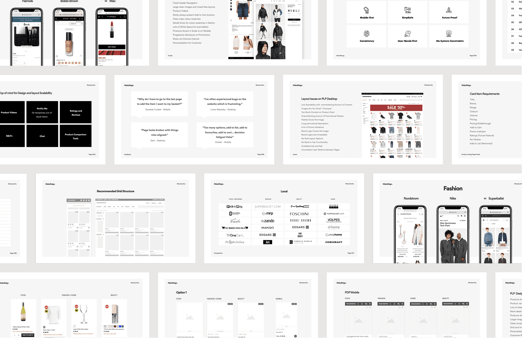
Slide deck presented to stake holders
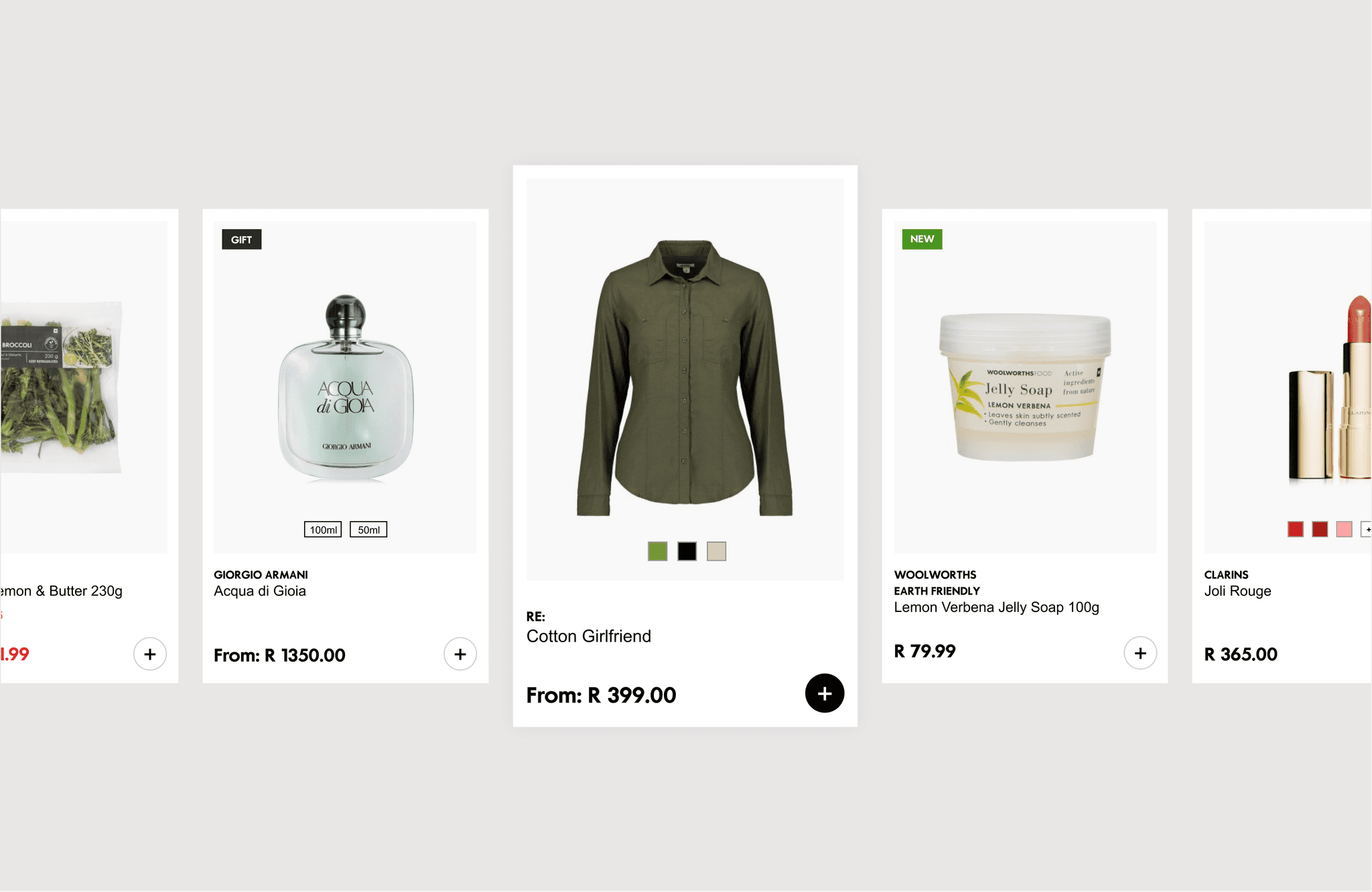
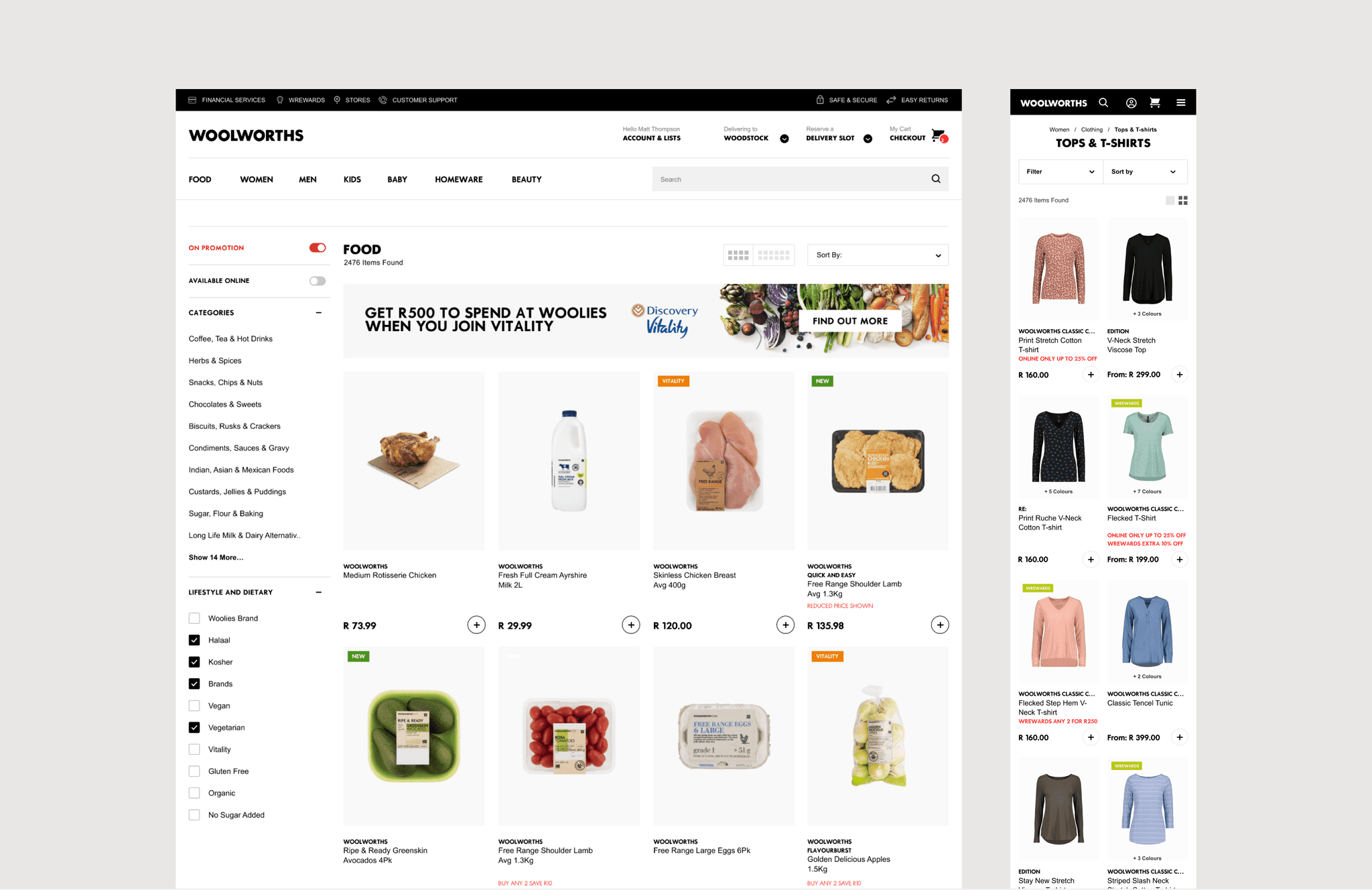
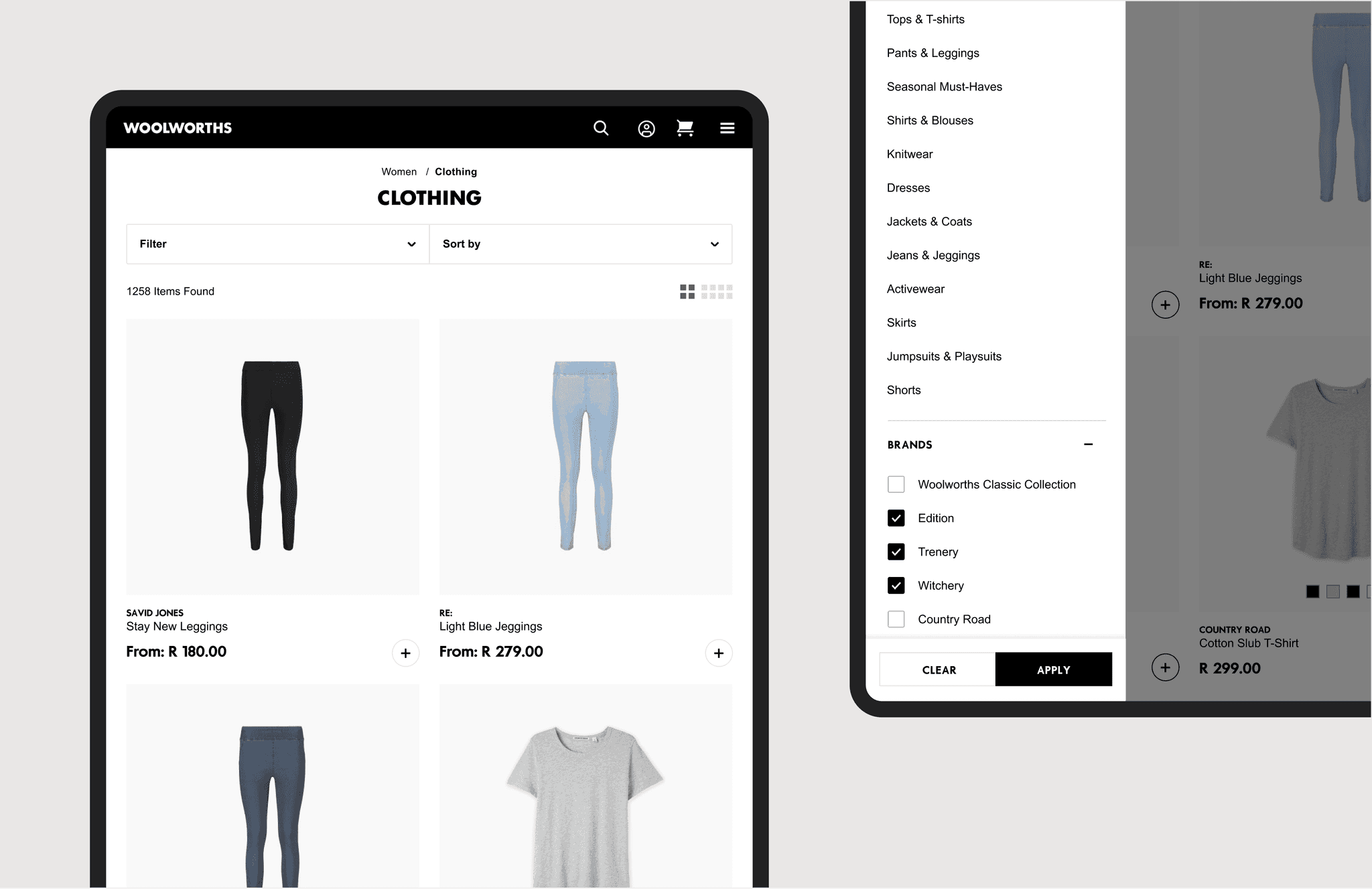
Improving the browse-ability of items to increase sales without sacrificing minimalism
Each department had their own clear financial targets and sales strategies, to ensure successful sales in their specialised area. This led us to examine the PLP Card in more detail and define guidelines for handling all of the information from each department in a simplified and contained way. We were able to deliver a PLP Card that included all necessary product information (Colors/Volume, Brand, Name, Tags, and more) from each department while maintaining a clean and minimal feel.
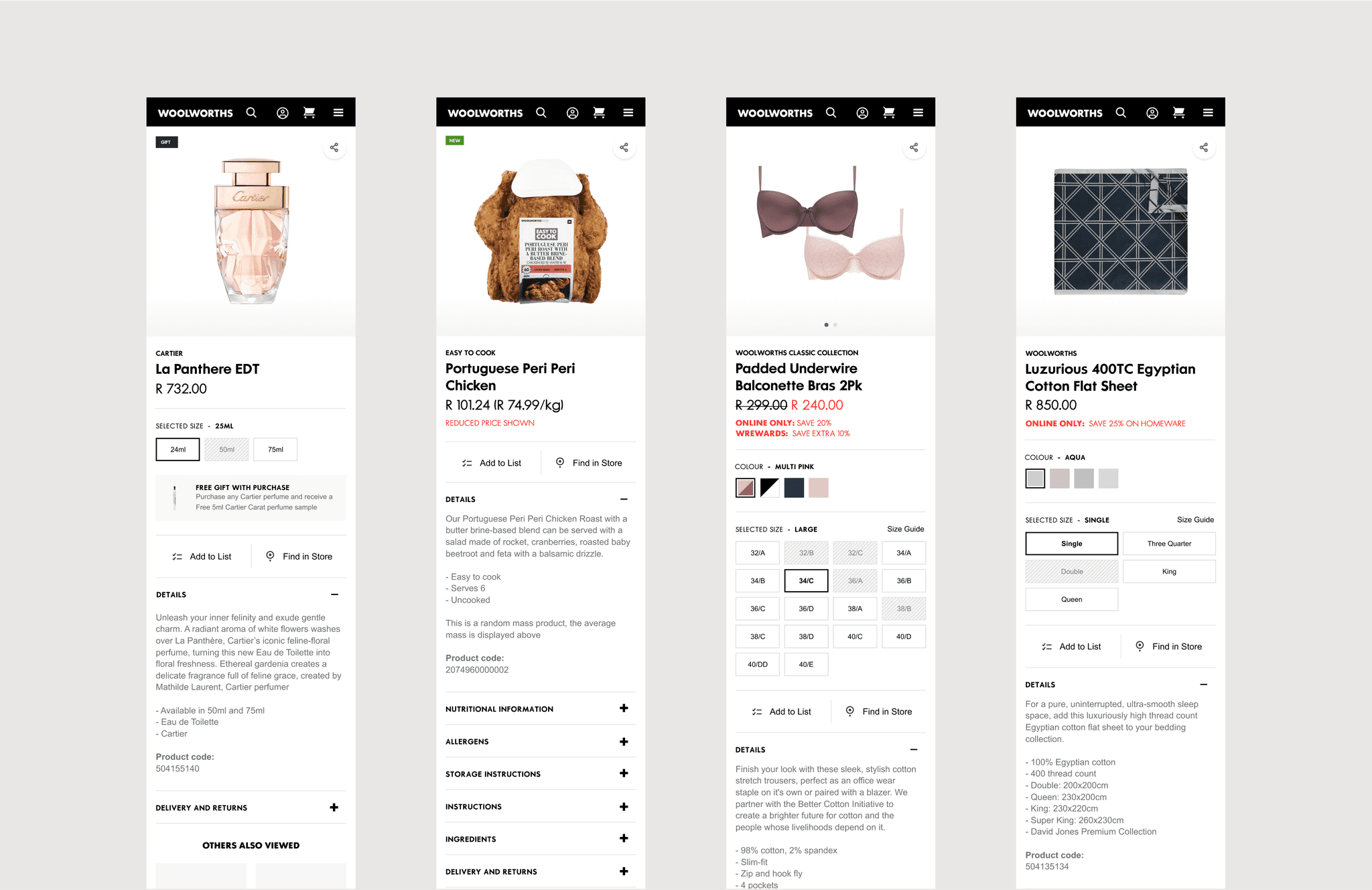
Providing the perfect amount of product information to a potential customer
Based on our research, we were able to define areas for UX and UI improvement for the Product Description Pages. Some of the improvements included, larger product imagery, scroll through thumbnails, free delivery call outs, find in store, recently viewed products and more.
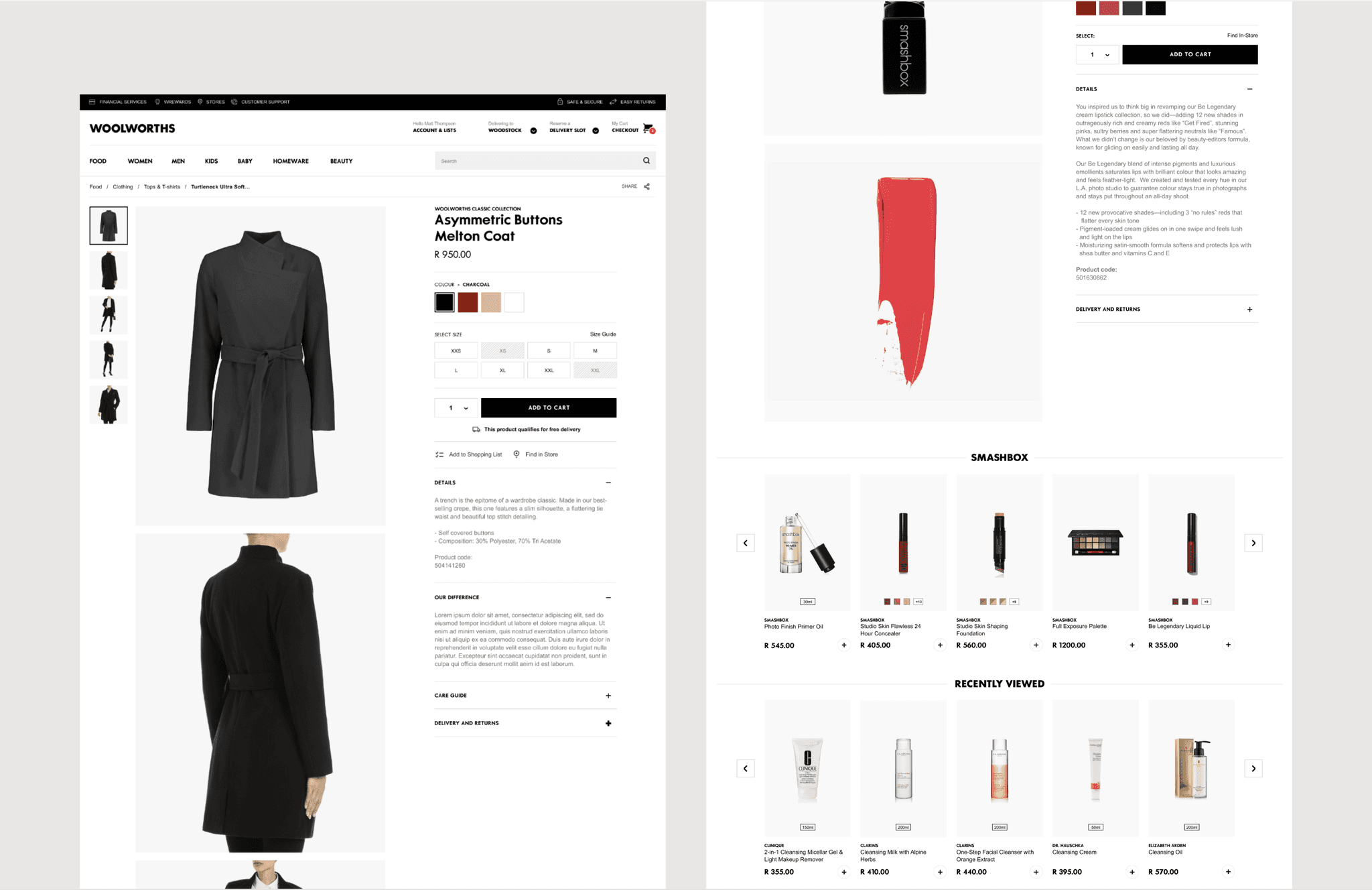
Product description pages